Letter with Me - Catawampus
This week’s Letter with Me word is catawampus (askew, crooked, or awry).
And what better way to play with a slightly crooked word than by adding one of my favorite lettering embellishments, banners!
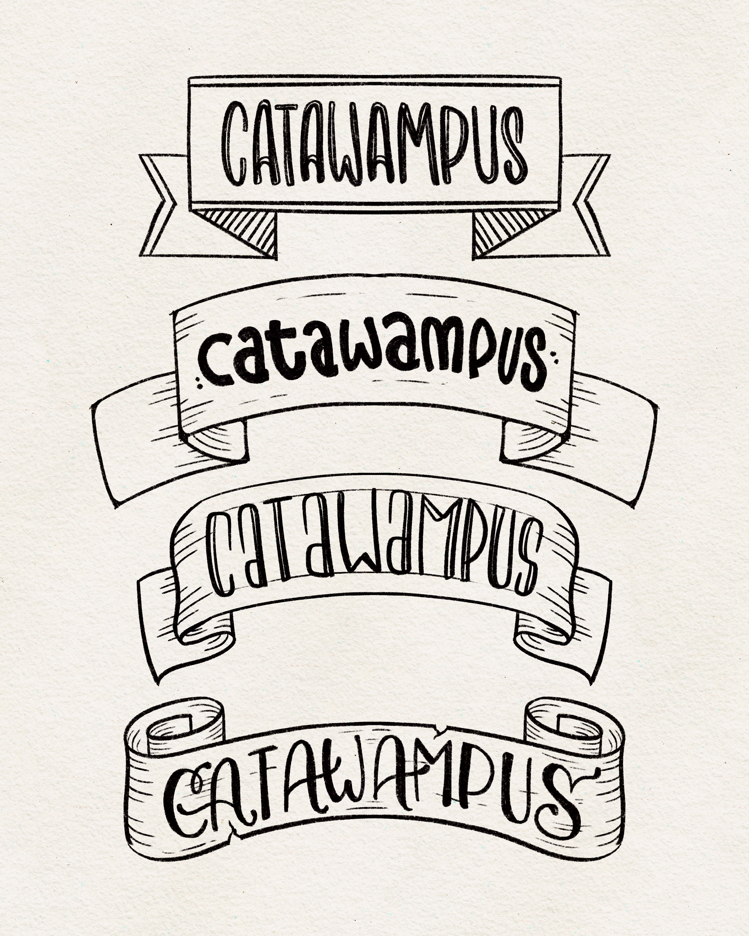
Banners are such a fun way to make your lettering compositions pop. They frame words beautifully for emphasis, help organize your layout, and can add just the right amount of flair. Plus, there are so many ways to draw them. Today, I’ll show you four simple banner styles you can start experimenting with paired with four different lettering styles for catawampus.
Banner Styles to Try
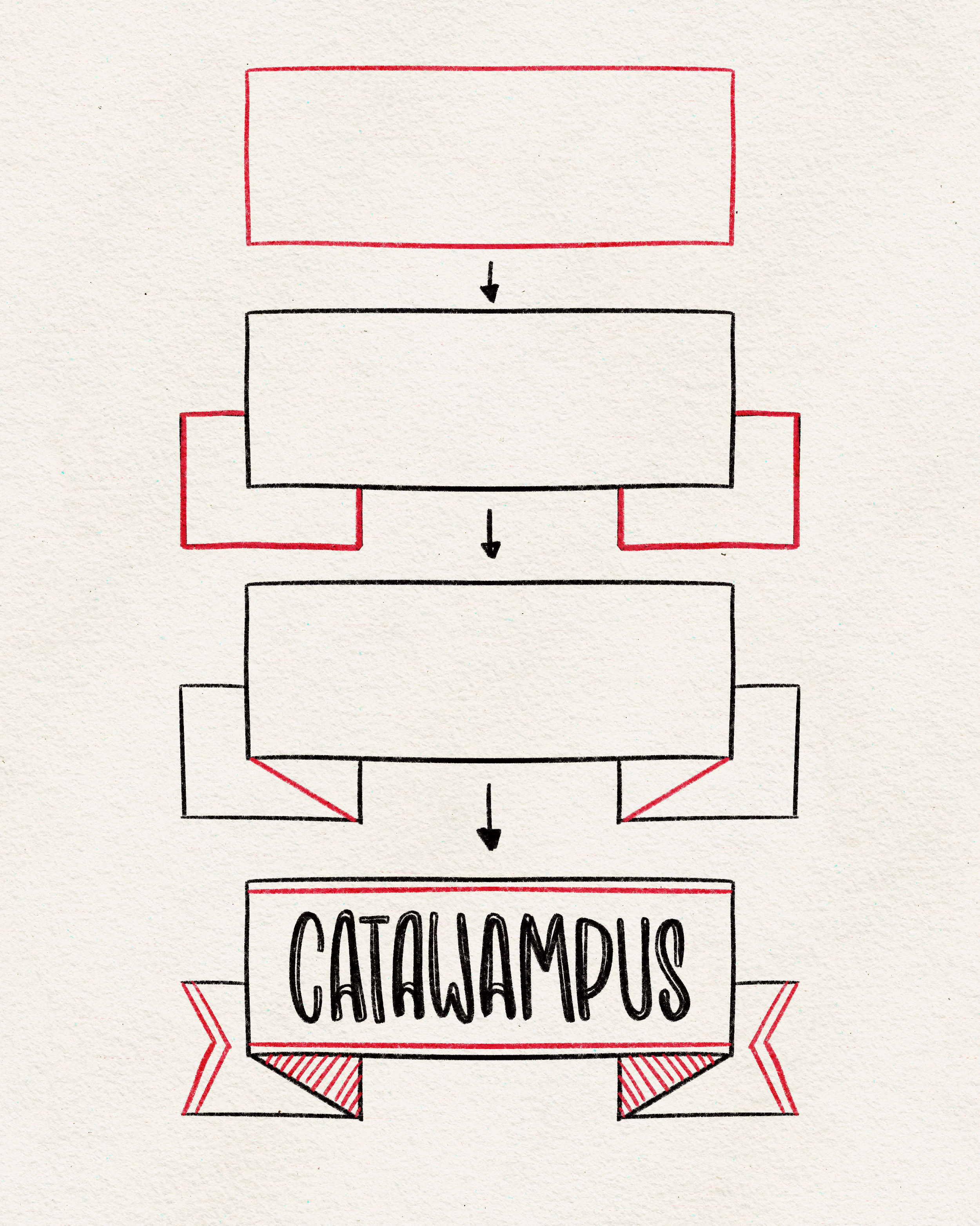
The Classic Rectangle
Start with a basic rectangle for your word, add two smaller side rectangles, and then connect them with diagonal lines. You can leave it plain and clean or jazz it up with embellishments. Simple but timeless.

The Curved Banner
This one bends slightly to create a graceful arc. I love this style when I’m lettering a quote with a long word followed by a short one because you can stuff that little word in the gap underneath the banner.

The Wavy Banner
Now we’re moving beyond straight lines! Real banners are cloth, so they bend and ripple. Add gentle curves to your lines, then sketch in small fold lines to show which way the banner is curling. This instantly feels more dynamic.

The Hidden Ends
Similar to the wavy ribbon, except the banner’s “tails” don’t show. This creates a smooth, flowing look that works especially well if you want the lettering itself to stay front and center.
Tips for Success
Don’t stress about making banners perfectly symmetrical; they don’t have to be! Some of my favorite designs are slightly off-balance, which gives them more personality. But it all depends on your quote and your compositions. Do banners that fit the space.
If you’re struggling to imagine how fabric might fold, grab a ribbon (or even a strip of toilet paper!) and curve it into the shape you want. Observing real folds makes drawing them much easier.
Very important to remember that your word should follow the shape of the banner as well. If you banner curves, then your word should curve. If it’s wavy, your word should be wavy. I highly recommend drawing guidelines following the banner so you remember!
A banner can transform your lettering from simple to show-stopping. So don’t shy away from using them in your designs!
This week’s challenge: Draw the word catawampus inside each of the four banner styles and see which one feels most natural to you. Then experiment: add waves, curves, or asymmetry until you find your favorite.
Have fun, embrace the askew-ness, and most of all—enjoy the process!