Composition and Spacing
We’ve talked about spacing within a single word before and how it can totally change the look and readability of your lettering, but did you know spacing in your overall composition is just as important?
There’s no hard and fast, right or wrong when it comes to composition spacing, but there is one rule I stand by: be consistent.
Inconsistent spacing is one of the quickest ways to make your lettering look off, even when your letterforms are solid. And most of the time, it’s not something you notice until it’s already distracting from the message of your piece.
To show you what I mean, I’ve used the quote “Everyone seems normal until you get to know them.”
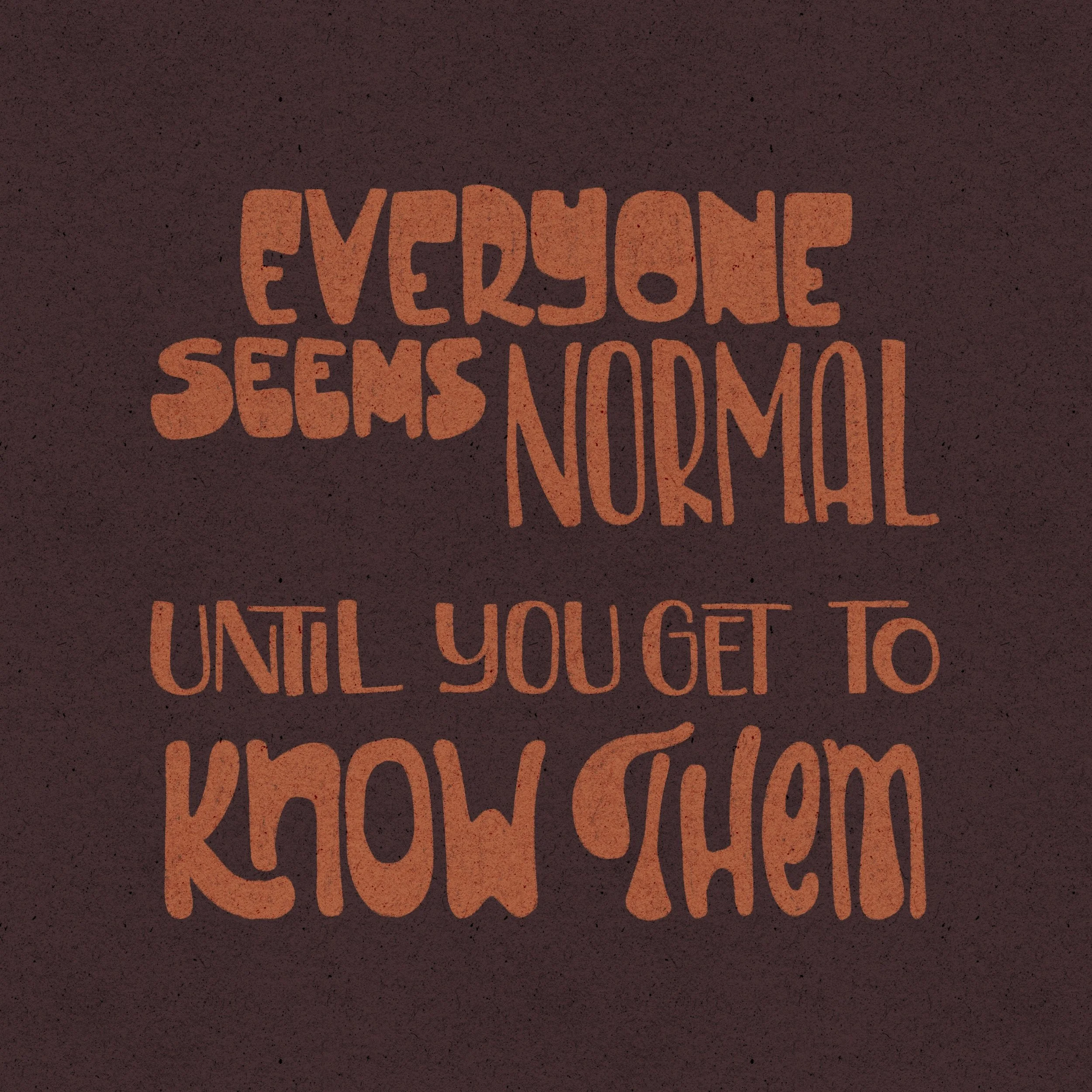
Inconsistent Spacing
This version has all kinds of weird gaps between words and lines. Some are wide, others are tight, and overall, it just feels off. The inconsistency pulls focus away from the quote and makes the layout feel unintentional and awkward.
If you don’t immediately know why something looks weird, check your spacing!
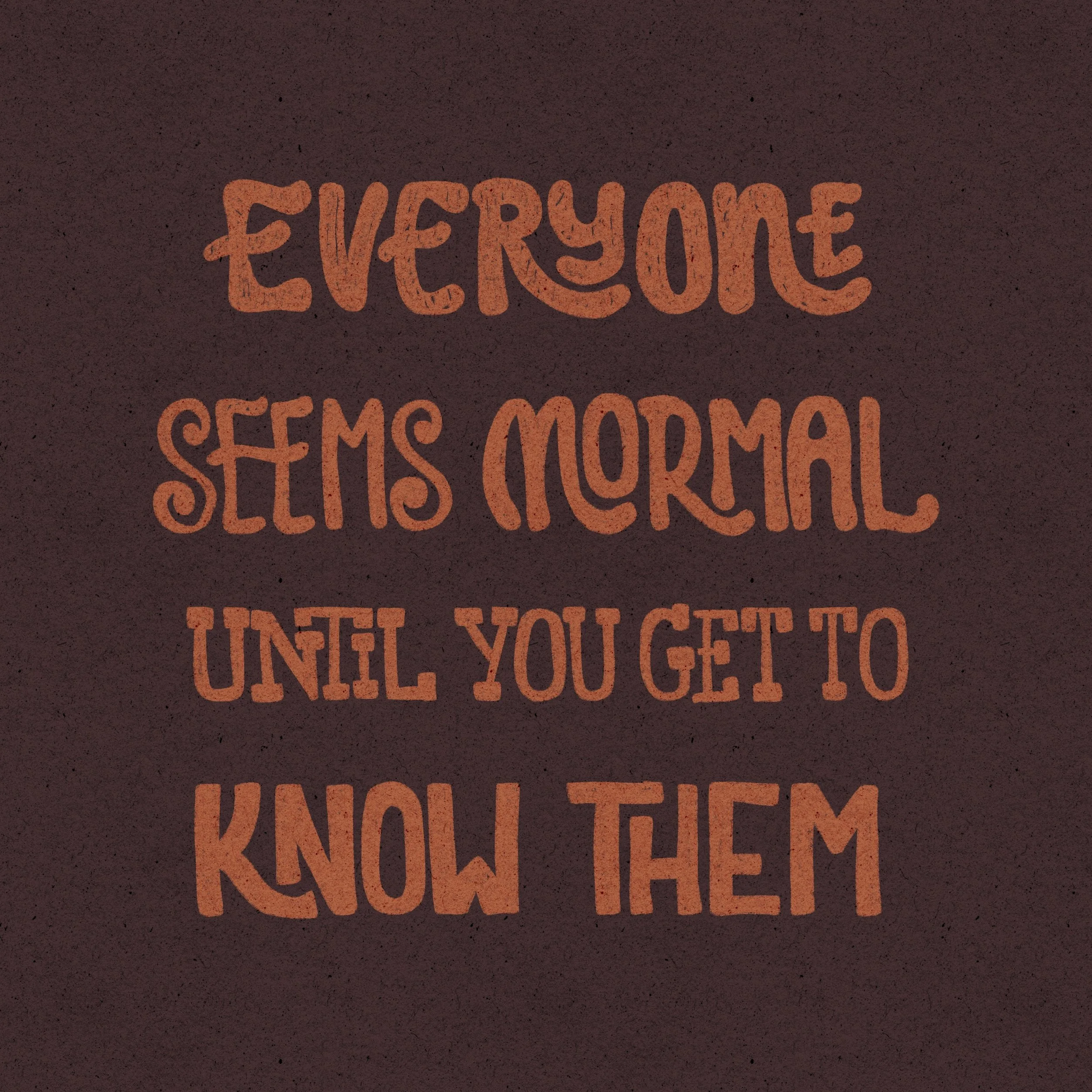
Wide Spacing Between Lines
In this version, I left large (to me) gaps between each line of the quote. And while that might work for some people or styles, I personally don’t love it. It makes the composition feel disjointed, like each line is a separate sentence, rather than one cohesive idea.
Wide spacing might work if your quote needs to feel airy or spacious, but be intentional with it. Match it to the quote!
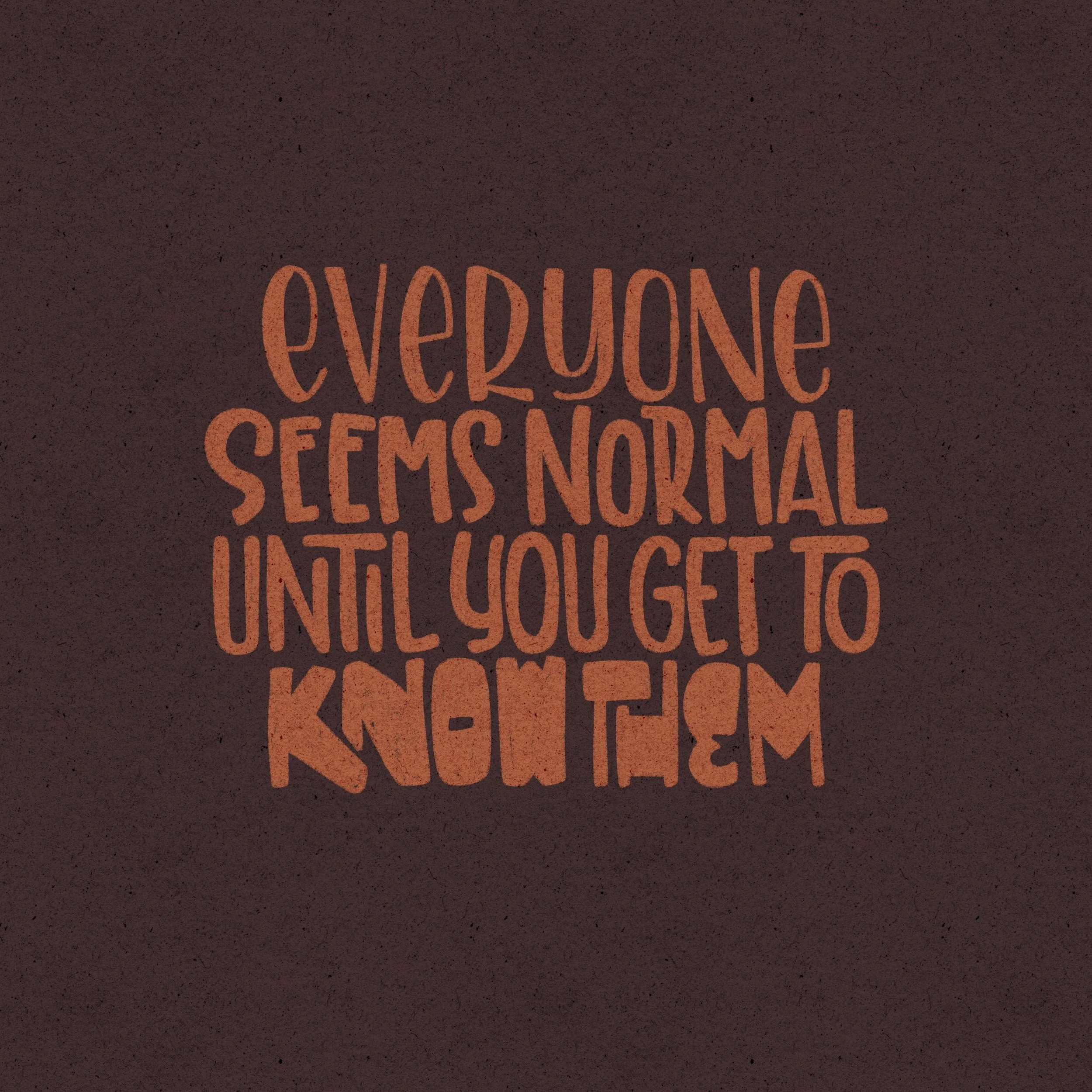
Tight Spacing
Now we’re swinging the other way with very tight spacing between lines and words. Tight compositions can look great, especially up close, but from a distance? It can all blur together into one big blob.
If you do want to go tight, try using outlined block letters (where they’re not filled in) or thinner monoline styles in parts of your piece to give the illusion of more space and help avoid a heavy, blocky look.
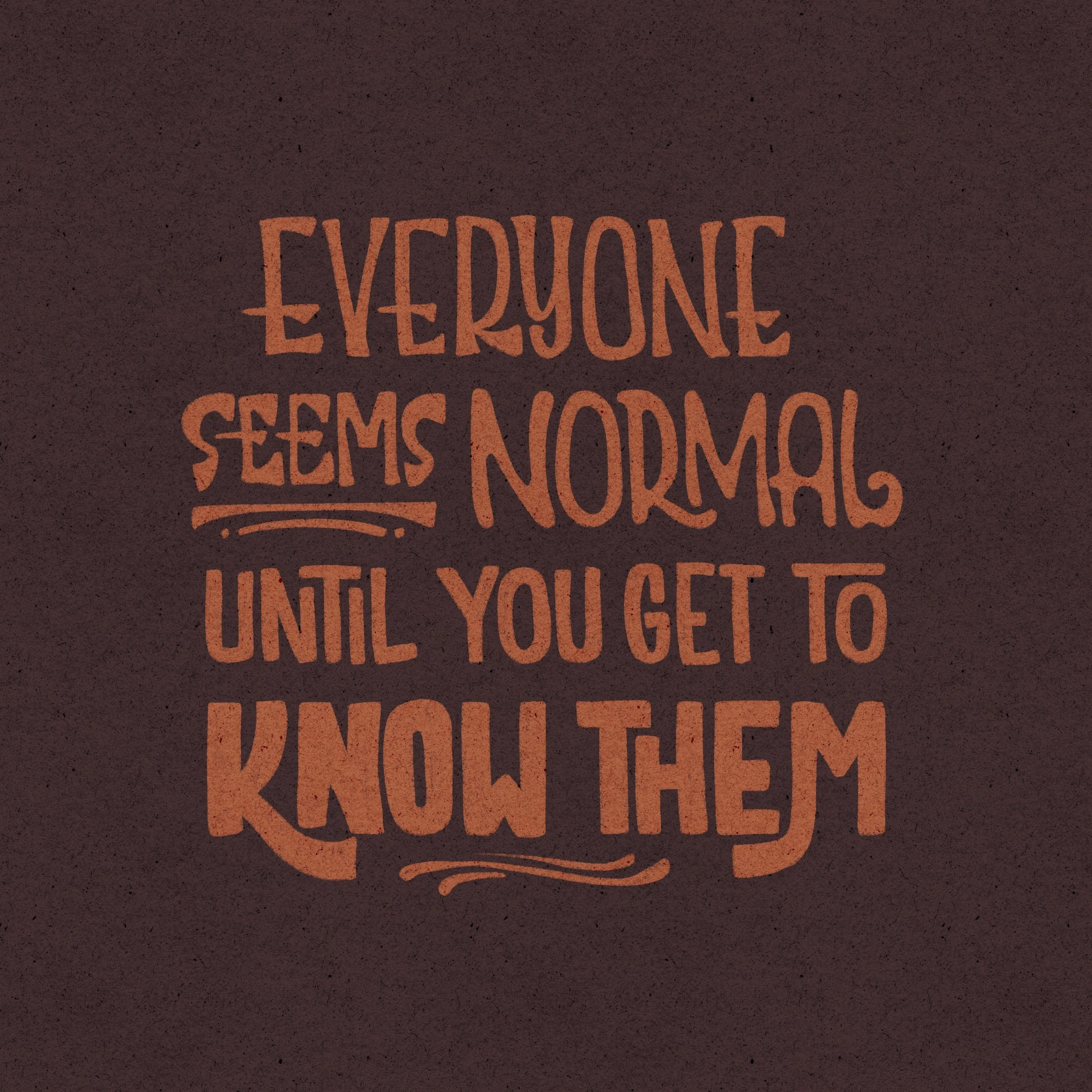
Consistent, Comfortable Spacing
This final version is just right, at least to me! The spacing between words and lines is consistent, not too loose, not too tight. It reads clearly and feels cohesive.
That said, this is all still personal preference! You might like your compositions looser, or maybe tighter depending on your style or the quote’s mood.
Use Spacing to Match the Vibe
Spacing isn’t just about looks, it can also enhance the mood of your quote.
For example:
A quote about anxiety might feel more intense with tight spacing.
A quote about calmness or reflection might look better with more breathing room.
Use spacing intentionally to help support the tone you're trying to convey in your composition.
To sum up
Be consistent with spacing
Practice with a variety of spacings to see what fits your style
Match spacing to the tone of the words
Use thumbnails to test different layouts
And above all … keep practicing!
Spacing can feel like a small detail, but it really impacts the overall vibe of your lettering, so give it the attention it deserves and trust your eyes! You may be tempted to use a grid or some other guidelines to make sure your spacing in consistency, and you should, but there are a lot of optical illusions when it comes to curves vs straight lines vs angles. So sometimes you got to go with visual spacing. If it looks off, it probably is.
Tell me …
What kind of spacing do you usually lean toward—tight, loose, or somewhere in between? Let me know in the comments or tag me @nolalettering with your practice experiments!