How to Make your Composition Pop
This week’s lettering tip is a continuation of our conversation around lettering composition, and today we’re focusing on an easy (and super effective!) way to add visual interest to your quote layouts:
Varying the size and/or style of your words.
In this age of endless scrolling and quick 5 second reels, your audience’s attention span is about three seconds long. If your quote doesn’t stand out at first glance, it’s getting skipped, especially if you’re posting your work to social media. Or if you’re selling your merch at a market, you’ll want to grab people’s attention to draw them into your stall.
So making sure your lettering composition pops and draws attention in (not away!) is very important.
Today I’ll be using the quote “All this reality is cutting into my reading time” (fact. Though in my case, it’s cutting into my gaming time. 😅) to demonstrate what I’m trying to say. Feel free to follow along and do the same things with a different quote!

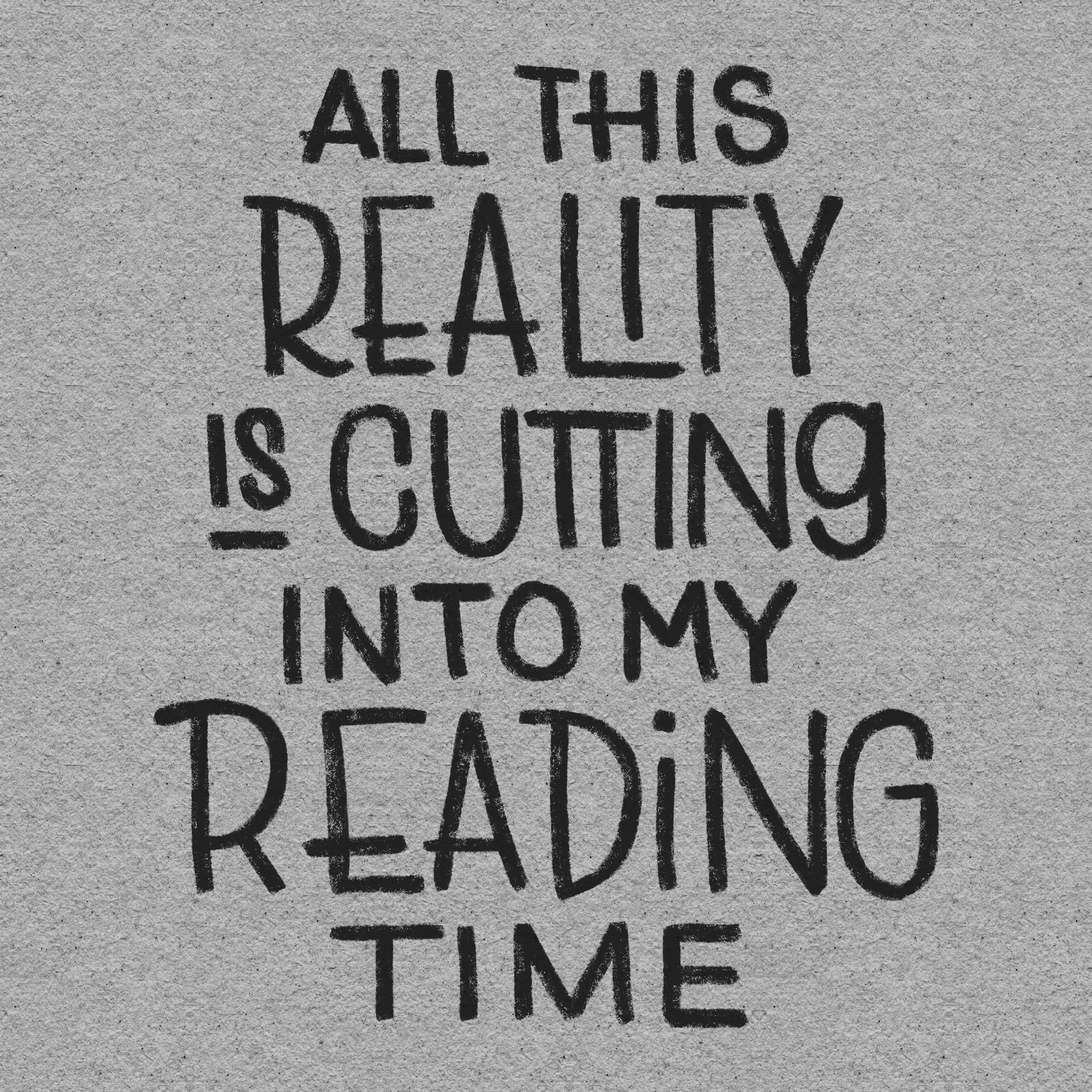
The “Neat but Boring” Version
In this first example, I lettered the quote using a very basic monoline style with all the same size, same style, everything consistent (more or less).
It looks clean, but honestly, it’s a bit boring. If you saw this quote while scrolling through your feed, would you stop and read/look at it?
There’s nothing in this composition that tells your viewer what to focus on. And with a longer quote like this one, that’s a problem. It makes the piece feel flat—and worse, it doesn’t visually communicate the point of the quote.
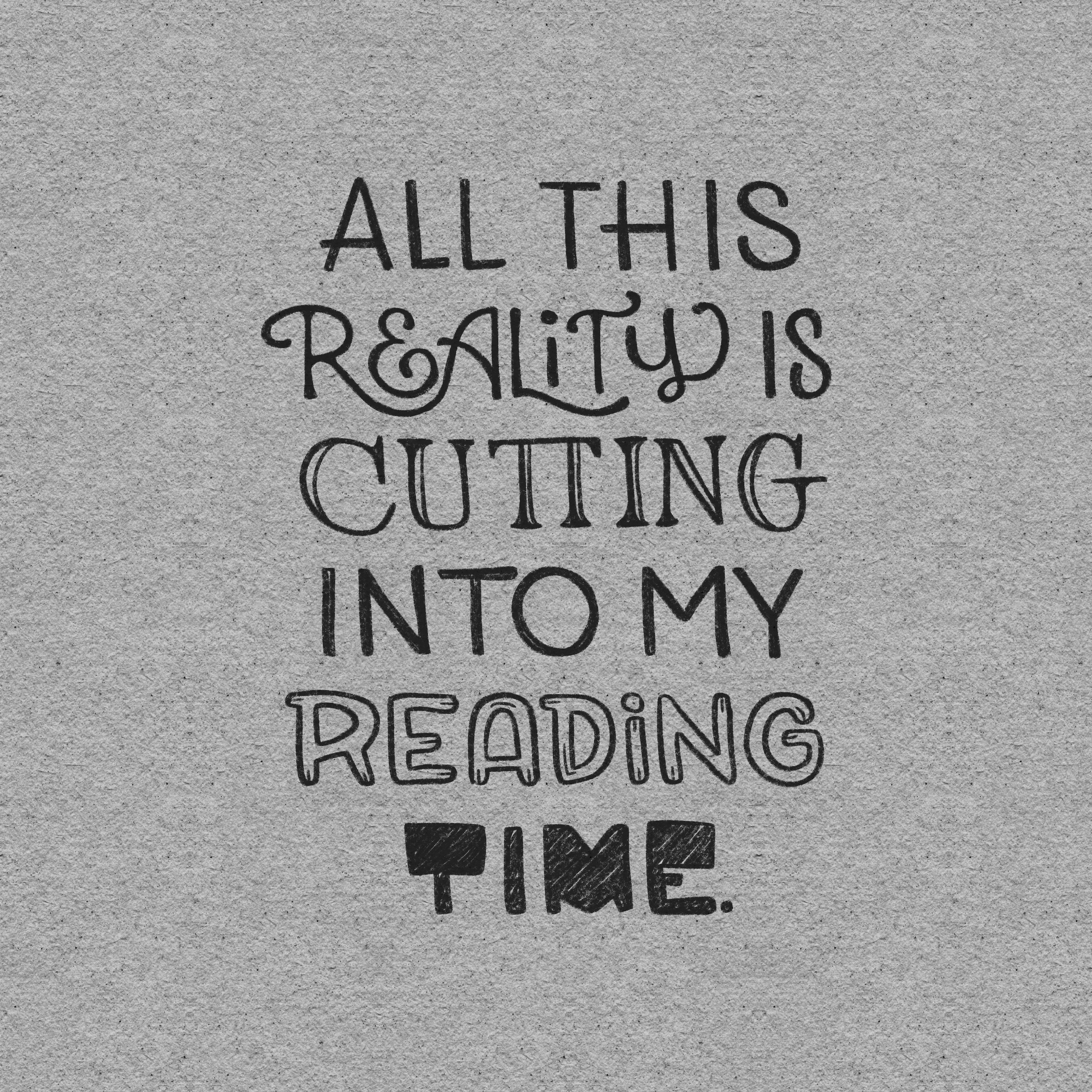
Using Size to Emphasize Key Words
In this second example, the words are still all in the same style, but now “reality,” “cutting,” and “reading” are obviously larger than the rest.
Those, to me, are the important words you want to emphasize. Even if someone only glances at those three, they’d still get the gist of the quote.
Pick the words that carry the most emotional or conceptual weight and make those bigger. You’re creating a visual shortcut for the reader’s brain.
More interesting composition than the first example, but still not the most attention grabbing.
Same-ish Size, Different Styles
Next up, I’ve kept all the words relatively the same size (same height, anyway), but used different lettering styles for those same three key words (and time).
The contrast in styles grabs your attention right away—even if the words are all the same size. The shift in visual rhythm naturally tells the viewer, “Hey! These are the important words.”
One thing to keep in mind, though, is that although all these words are the same height, it feels like “into my” is bigger than the rest. There’s some visual trickery your brain plays depending on the width/spacing of your letters. So visually gauging sizes is important to do as well, don’t just trust your grid.

Style + Size = Maximum Impact
Finally, in this last example, I combined size and style variation, and that’s where the magic really happens.
The important words are both bigger and visually distinct, which creates instant hierarchy. The supporting words are still there, but now they’re just that—supporting. They’re smaller and in the same style so they don’t fight for attention.
This is what I try to do in almost every composition:
Highlight the words that matter
Downplay the ones that don’t
Guide the viewers’ eyes through the composition

Four in one
Here they are, all in one image. Which one’s your favorite?
When you go the varying styles route, you don’t have to make all your important words different styles, like I did. You can do one style for all the basic words and one style for all the important words.
While I’m personally a fan of including many different lettering styles within one piece, something to be aware of is that putting too many of them can make your composition messy.
It is a thin line between wow and whoa.
Final Thoughts
When you’re working with longer quotes, you have to not only attract, but also guide your viewer’s eye. Otherwise, they’ll move on before they even read what you created.
So next time you're lettering, ask yourself:
Which words in this quote carry the most meaning?
Can I make them stand out with size or style—or both?
Are the less important words staying in the background?
Keep practicing, keep playing, and you’ll start to develop a feel for what works best for your voice and aesthetic.
And hey—if you try this method with a different (or same) quote, tag me @nolalettering! I’d love to see how you use size and style in your next quote.