Exploring Lettering Styles Using Simple Shapes
Today’s post is all about letting loose, getting weird, and embracing the beautifully imperfect process of developing your own lettering style. We are going to use basic shapes as the inspiration and boundaries for creating different styles of the same word: poppycock. Yep, poppycock. It's fun to say and to letter!
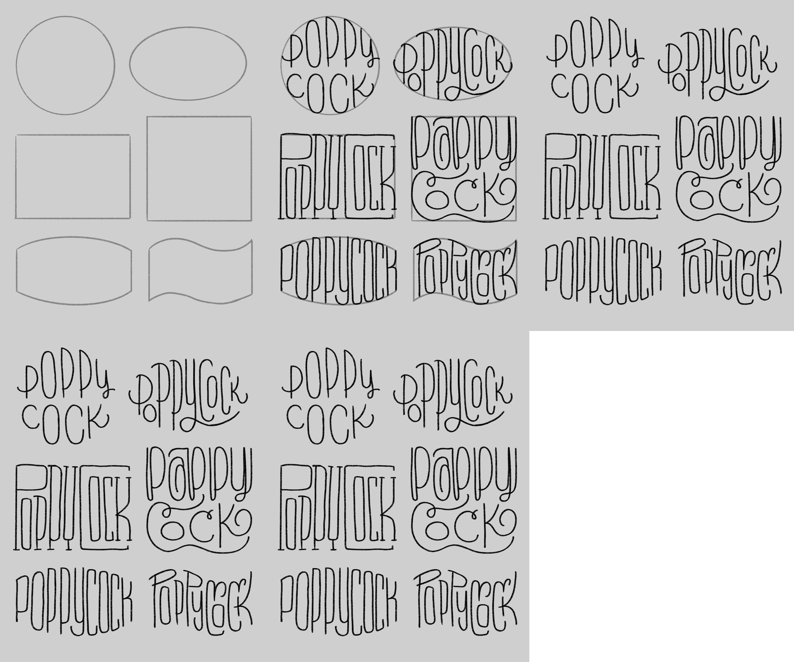
For this practice, I used the following six shapes:
A circle
An oval
A square
A rectangle
A rectangle with rounded tops and bottoms
A wave
I wrote the word poppycock inside each shape in monoline, and let me tell you—some turned out wild, some were barely legible, and all of them taught me something.
Why shapes?
Shapes give you structure, but they also force your brain to solve new visual puzzles. How do you make curvy letters fit inside a stiff square? What happens when you stretch letters to fill an oval? How do you work with a wiggly wave? These questions push you out of your comfort zone and make you think differently about letterforms.
Let’s break it down!
The Circle:
Circles are soft and symmetrical, so I leaned into rounded letterforms. Everything had to tuck into this cozy loop, so I squished and curved the letters to follow the arc. I couldn’t fit the entire word on one line, so I split it into two: poppy and cock. Some words have natural separation points, so use that to your advantage when needed. The result? A compact, whimsical version of poppycock that is still pretty legible. Win!
The Oval:
This one felt similar to the circle, but a bit roomier left to right. Which made it possible to fit the entire word in on one line. I found myself elongating strokes (like the y) and experimenting with spacing.
The Rectangle:
Okay... so … this one looked like I wrote poopyock. 😂 But! I kind of loved the accident. I tried to contain the “ock” within the shape of the “C,” and while legibility isn’t the best, it sparked a fresh idea I want to revisit. Sometimes the best breakthroughs come from "mistakes."
The Square:
Although squares typically make us think of rigid, angular lines, I wanted to step away from that expectation. So instead of sharp corners and blocky letters, I filled this shape with curls and swirls. There are still a few straight strokes to hug the edges of the square, but the inside was a total free-for-all. It’s not my favorite of the bunch, but it was a blast to try something so different. Sometimes just flipping the script on what a shape should look like leads to unexpected creativity.
Rounded Rectangle:
I decided to go simple with this one and just write the word straight across without adding any embellishments. It’s easy to read, and because it’s not the usual rectangular shape, there’s still some visual interest. If you’re just starting out, writing words in different shapes is probably the easiest way to make your lettering stand out and feel fun without overthinking it.
The Wave:
My favorite shape of the bunch! Letters danced up and down along the curves, and it turned into this whimsical, almost storybook-style piece. I had to play with the baseline to fit the wiggle and even layered a few letters to keep the flow going. It was chaotic in the best way.
Takeaways:
Let go of perfection. Some versions will be weird, some unreadable—and that’s totally okay. This is playtime.
Experiment with structure. Use shapes to push your lettering in directions it wouldn’t normally go.
Customize your strokes. Elongate, curl, compress—whatever it takes to fit the form.
Layer if needed. Letters don’t always have to line up in a row. Try overlapping, stacking, or weaving them through the shape.
Harvest ideas. Even if the overall design doesn’t work, you might stumble onto a stroke, connection, or composition trick to use later.
I’d love for you to try this out! Pick one word (maybe even poppycock 😜), draw six shapes, and see how many different ways you can interpret the word. Don’t worry about perfect lines or fancy tools—just grab a pencil and let your creativity lead.
Tag me (@nolalettering everywhere) if you post your experiments—I’d love to see what you come up with! And feel free to let me know what questions or thoughts or future tutorials you’d like!
Until next time, keep playing with your letters. ✨


