Why does my lettering look weird?
While I wouldn’t say this is the #1 mistake new hand lettering artists make, it’s definitely in the top 3. If your lettering always looks off, it’s probably this.And no, it’s not your pen/paper/iPad. Nor your your lack of “natural talent.” And it’s not even that one letter you keep redrawing over and over and that’s why it looks weird.The real reason?Inconsistent spacing and messy baselines.Yup. That subtle unevenness between letters or the way some words ride higher or dip lower than others—it’s enough to throw off the entire composition, even if everything else is beautiful.Why This Happens
When you're first starting out with lettering, you're (understandably) focused on the letters—how they look, how to form them, and how to make them “pretty.” But letters don’t live in isolation. They live in relation to each other.Without consistent spacing and a steady baseline, even the most gorgeous letterforms can feel disjointed.It’s kind of like baking a cake with beautiful frosting but uneven layers underneath.What to Look Out For
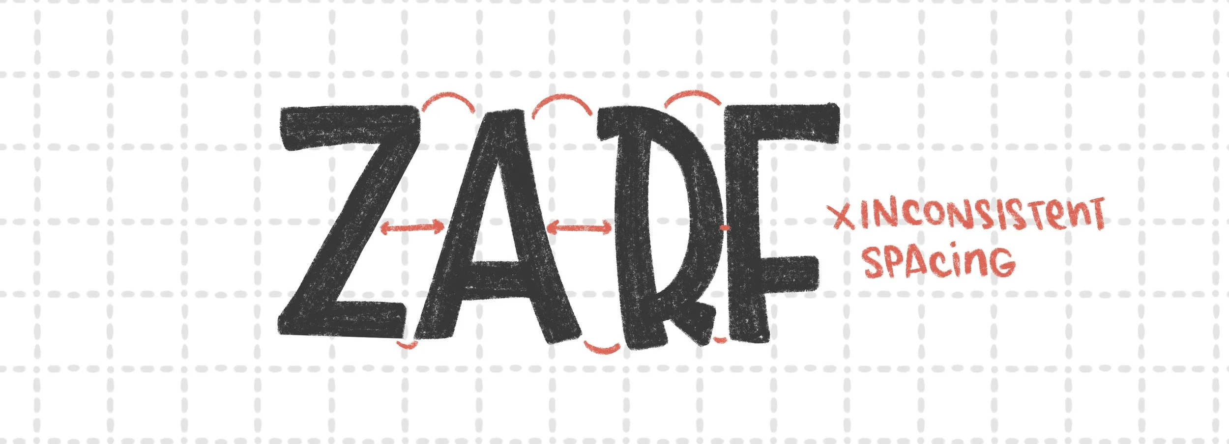
Uneven gaps between letters (aka: kerning chaos)
Some letters feel too close. Others feel too far. The word looks jumpy or squished in places.

Letters tilting in different directions
If one leans left and the next leans right, it creates a tug-of-war effect for the eye.

Inconsistent baselines
Your letters aren’t sitting along the same invisible line—they’re dipping or floating randomly.
How to Fix It
1. Draw baselines (and even midlines) first. Use light pencil lines or a grid to guide your lettering. You can always erase them later, but having that structure makes everything easier.
2. Check your spacing visually. Instead of measuring exact distances, focus on how the white space between letters feels. Trust your eye—but also step back and look at the word as a whole. I can’t emphasize this enough. There are times when the letters are evenly spaced, but it looks off. That’s because the white space between letters will always be different, depending on which letters are next to each other. Visual spacing works out the best, but this does take practice. The more you look at examples and practice on your own, the easier it will be for you to visually see consistent spacing.
3. Practice with simple words. Choose a short word (like “hello” or “love”) and rewrite it a few times, focusing only on spacing and alignment—not flourishes or style.
4. Use tracing paper or layers (if digital). Overlay your lettering with guides (I always use a grid when I’m lettering) to see where things are off kilter. Sometimes it's subtle, but fixing it makes a huge difference.
5. Flip your work upside down. This is a pro trick! Seeing your lettering flipped removes the distraction of meaning and helps you spot alignment and spacing issues instantly.
6. Take a step back or take a break, then come back to it. Stare at something too long and everything looks right or wrong. So breaks are good! Often times, you’ll notice things you hadn’t before.

Do all that and your lettering will look clean and pleasing to the eye.
Keep in mind, though, that it doesn’t have to be perfect. Good enough will do because the eye/brain will fill in the little imperfections. And those imperfections will also give your lettering more character.

Bonus tip!
This one’s more for composition, but consistent spacing is important as well between words not just between letters. If it’s inconsistent, then your whole piece won’t look cohesive and will also look off. Whatever style you decide, always make sure your spacing is consistent!
You don’t need perfect handwriting. You don’t need fancy pens. And you definitely don’t need to master every style before you start creating. But if you want your lettering to go from "something’s off" to "wow, that looks polished!" — spacing and alignment are things to keep in mind. They’re the quiet details that make your lettering sing.Let me know if you have any questions/thoughts/feedback. And also what else you’d like to know about lettering! Thanks for reading :) PS - If you’re wondering what zarf means, it’s the paper sleeve that you sometimes get with your hot coffee! I had no idea it even had a name. I always thought it was just a sleeve. Ha.