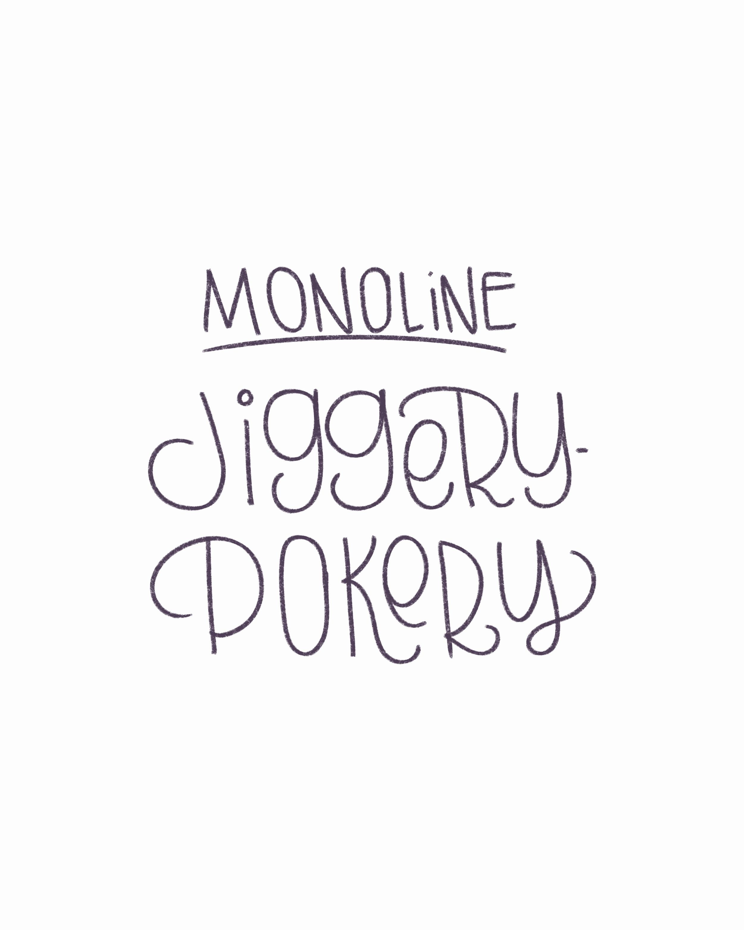
Letter with Me - Jiggery-Pokery
This week’s Letter with Me prompt is the delightfully mischievous word: jiggery-pokery, a noun meaning deceitful or dishonest behavior. It’s whimsical, rhythmic, and packed with potential for practicing a wide range of lettering styles!

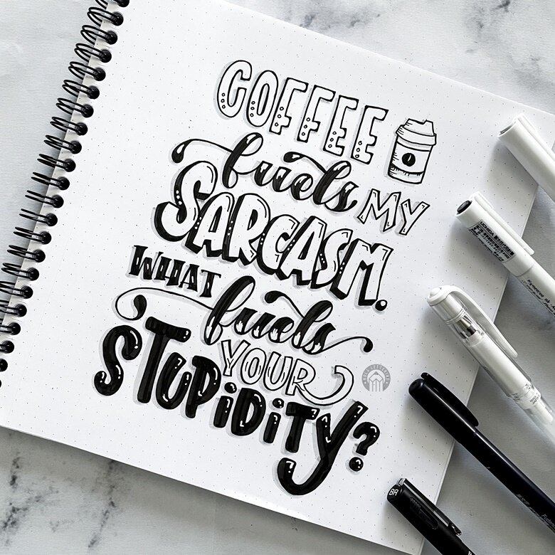
Why does my lettering look weird?
While I wouldn’t say this is the #1 mistake new hand lettering artists make, it’s definitely in the top 3. If your lettering always looks off, it’s probably this.
And no, it’s not your pen/paper/iPad. Nor your your lack of “natural talent.” And it’s not even that one letter you keep redrawing over and over and that’s why it looks weird.
The real reason?
Inconsistent spacing and messy baselines.

How many lettering styles should I use?
The age old question, how many lettering styles should you include in a composition? Read on to find out!