Letter with Me - Jiggery-Pokery
This week’s Letter with Me prompt is the delightfully mischievous word: jiggery-pokery, a noun meaning deceitful or dishonest behavior. It’s whimsical, rhythmic, and packed with potential for practicing a wide range of lettering styles!
Let’s break down a few different styles I explored this week, and how you can stretch your own creative muscles while lettering this fun word.
And just in case you need it, here’s the prompt list we’re working through: click click click!
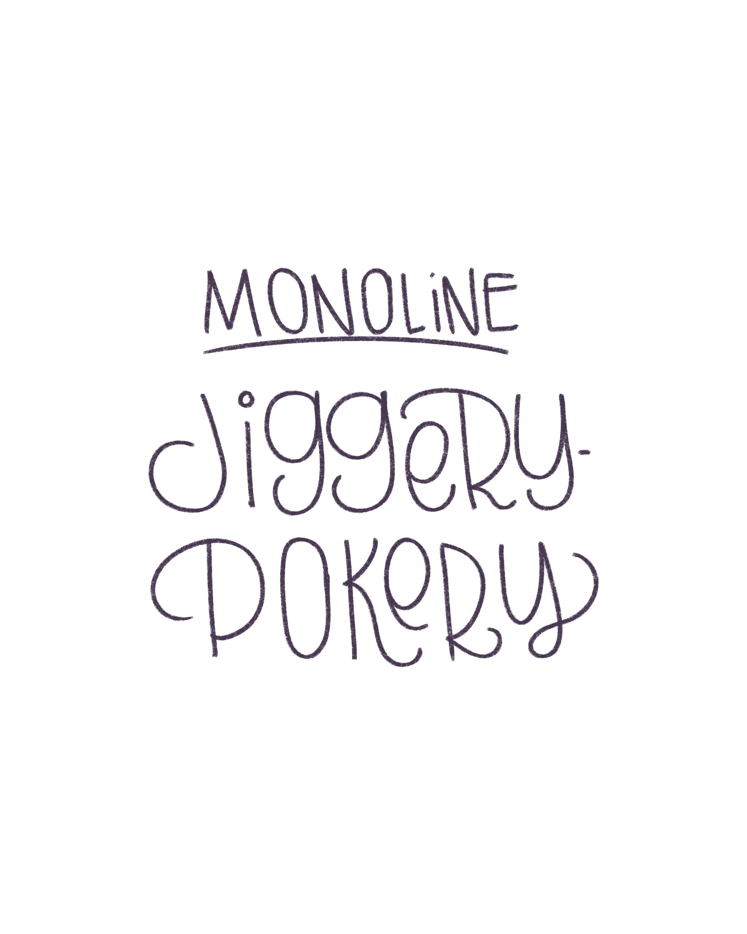
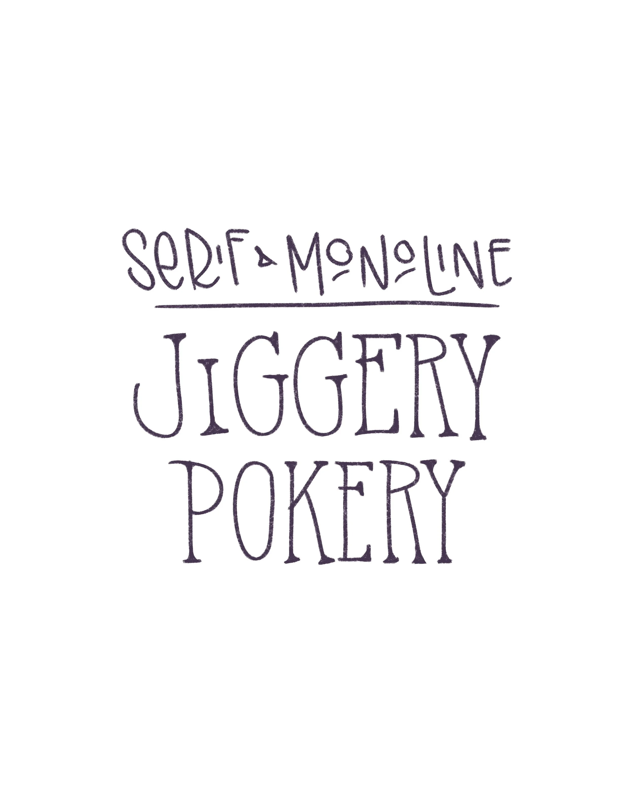
Monoline
Monoline lettering, where all the strokes are the same thin width, might seem simple, but it’s easy to fall into the trap of just writing how you normally write. And while that’s a good starting point, it can also be kind of boring.
But here’s the good news: monoline doesn’t have to be boring! You can add curls and swirls, try angular sharp edges, play with spacing, or even make your strokes shoot off in all directions. I recommend coming up with a few ridiculous variations just for fun because monoline is often the base of more complex styles, so the more creative you get here, the more you can build off it for fun styles!
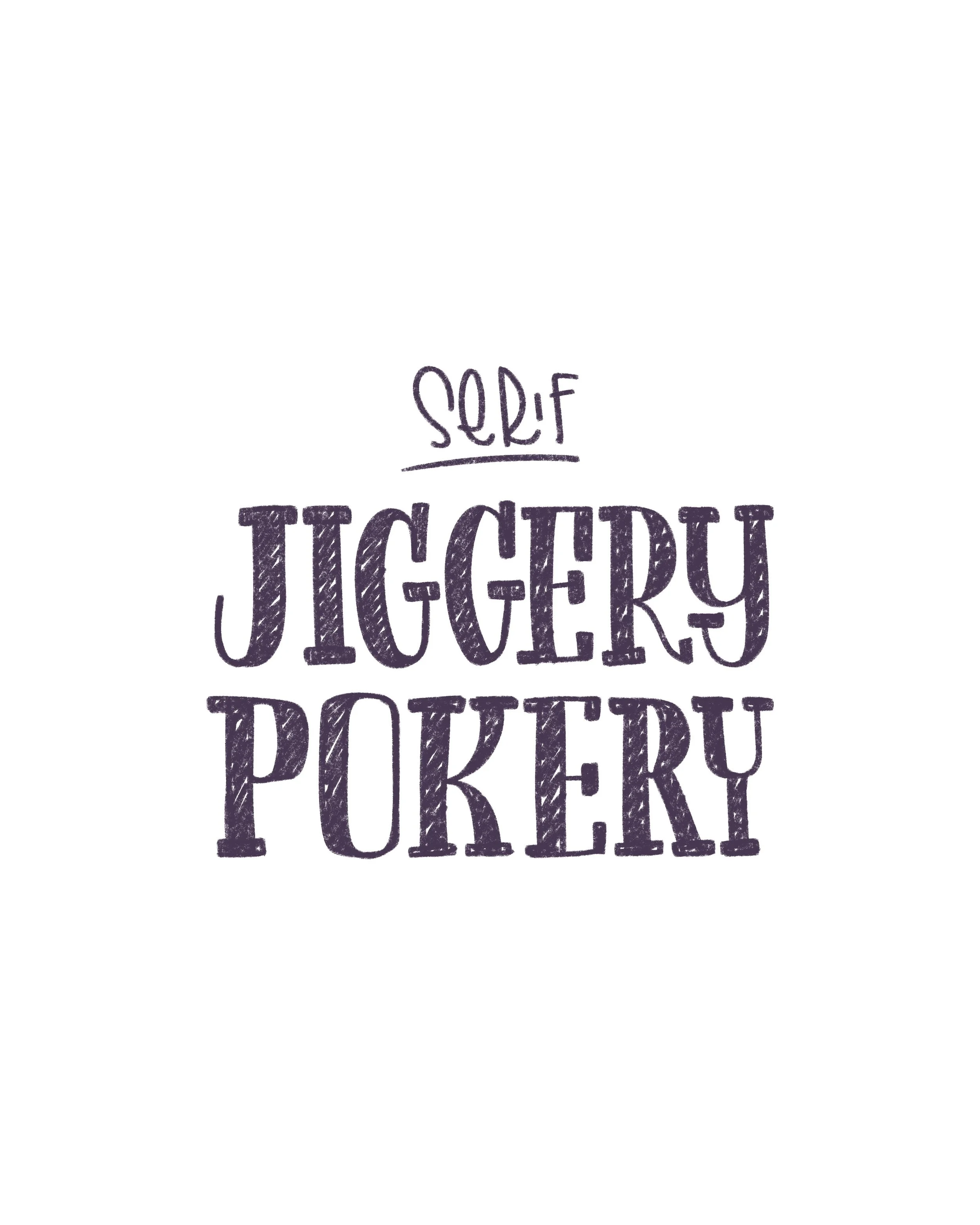
Serif
Serifs are the little “feet” or strokes at the ends of your letters. In my example, I used block-y rectangular feet, but there are so many options: rounded, angled, triangular, even curled! Try them all.
The letterforms themselves can mimic calligraphy strokes—thick downstrokes and thin upstrokes—or keep a consistent width throughout. Either approach works. Try different combinations and see what speaks to you.
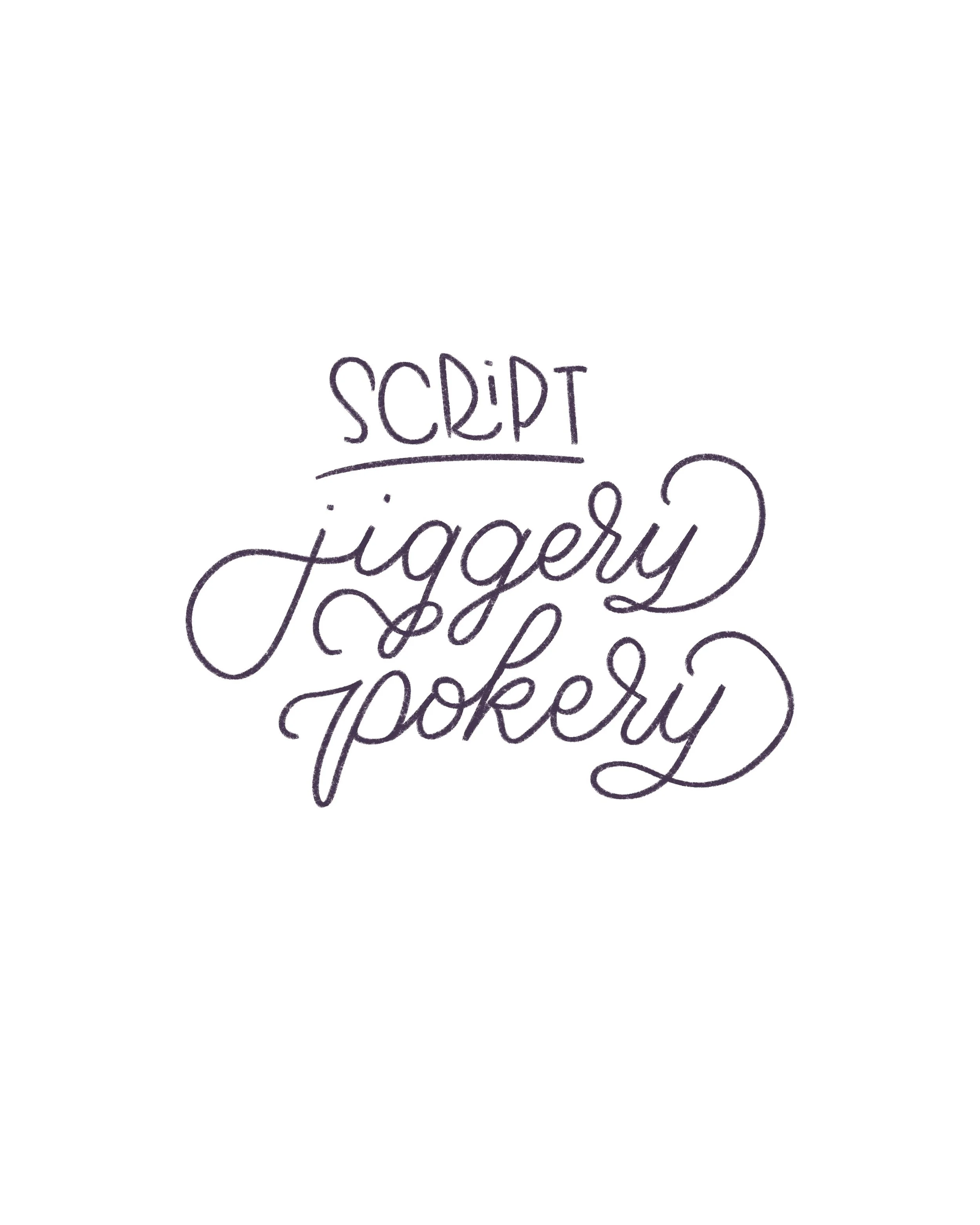
Script
Script is another broad category with tons of possibilities. I went with a traditional cursive with some flourishes here, but you could try faux calligraphy, brush calligraphy, modern script, or any variation in between.
If you’re new to calligraphy, I highly recommend The Happy Ever Crafter’s Modern Calligraphy course. It’s how I not only learned calligraphy, but also what started me down my lettering journey. Not sponsored, just genuinely helpful.
Block Letters & Bubble Letters


Block and bubble style letters are very similar except that block letters are bold, structured, and square-edged. Great for clarity and punchy emphasis. Try playing with proportions, extra tall or wide, or stack them up like Tetris pieces for even more fun. Bubble letters, on the other hand have rounded corners that give them a more friendly, approachable vibe. They’re also really fun to experiment with—outline them, fill them in, or add patterns inside. If you really want to emphasize the bubbliness, don’t forget the exclamation points for highlights.
Combos!
We’ve covered some of the most basic styles. Now we come to combining them in various ways to create something new and personal. For example, I mixed monoline with triangular serifs here, but you can also try bubbly script, blocky serifs, or anything in between.
The more you practice, the more your creative instincts will kick in, and before long, you’ll be creating your own hybrid styles.
Final Thoughts
We’re often so used to seeing and writing letters in one way that it takes a little loosening up to re-imagine them. That’s why I recommend doing what I call “stream-of-consciousness lettering.” Just sketch out idea after idea without judgment or self editing. Let your hands guide you and try to turn off your inner critic. Don’t stop to critique—just letter!
And remember:
This is practice.
Not perfection.
No pressure.
Just penjoyment.
Now go try out some wild styles, experiment with this cheeky word, and have fun with the process. I can’t wait to see what you come up with!