Letter with Me - Petrichor
Letter with Me: Petrichor in a Circle
Welcome back to the Letter with Me series! This week’s word is a beautifully specific one: petrichor (n.) a pleasant smell that frequently accompanies the first rain after a long period of warm, dry weather. And if you need a reminder of what our list of words are, click here!
This week’s challenge? Letter the word petrichor inside a circle.
Now, there are many different ways to approach this, and today I’m sharing a few of mine to help you get inspired and explore different compositional ideas. Here’s a quick animated gif to give you an idea of my different designs in relation to a circle shape.
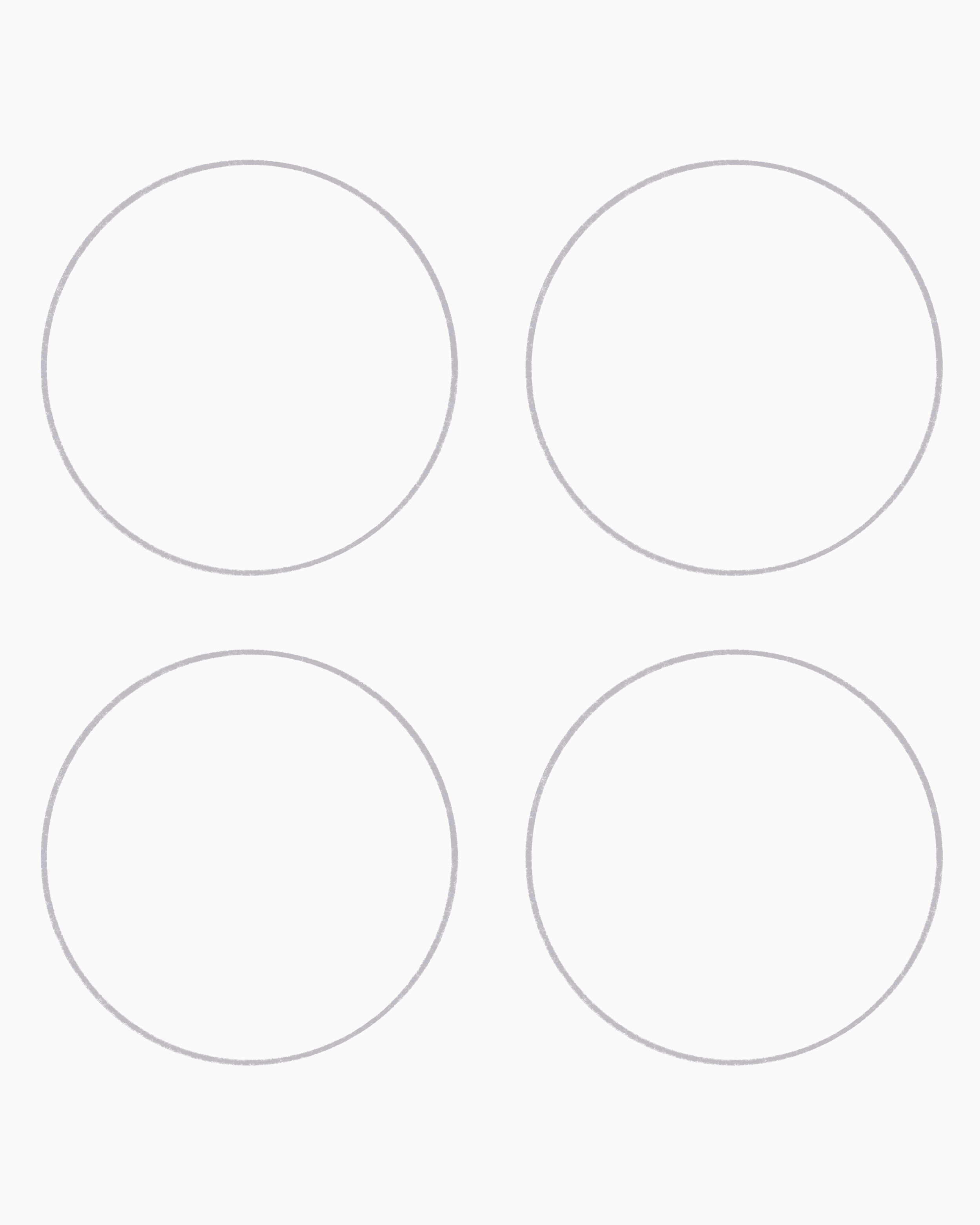
Start with 4 empty circles then slowly fill them in! And you can remove the circles at the end and see your words!
Fill the Circle with the Word
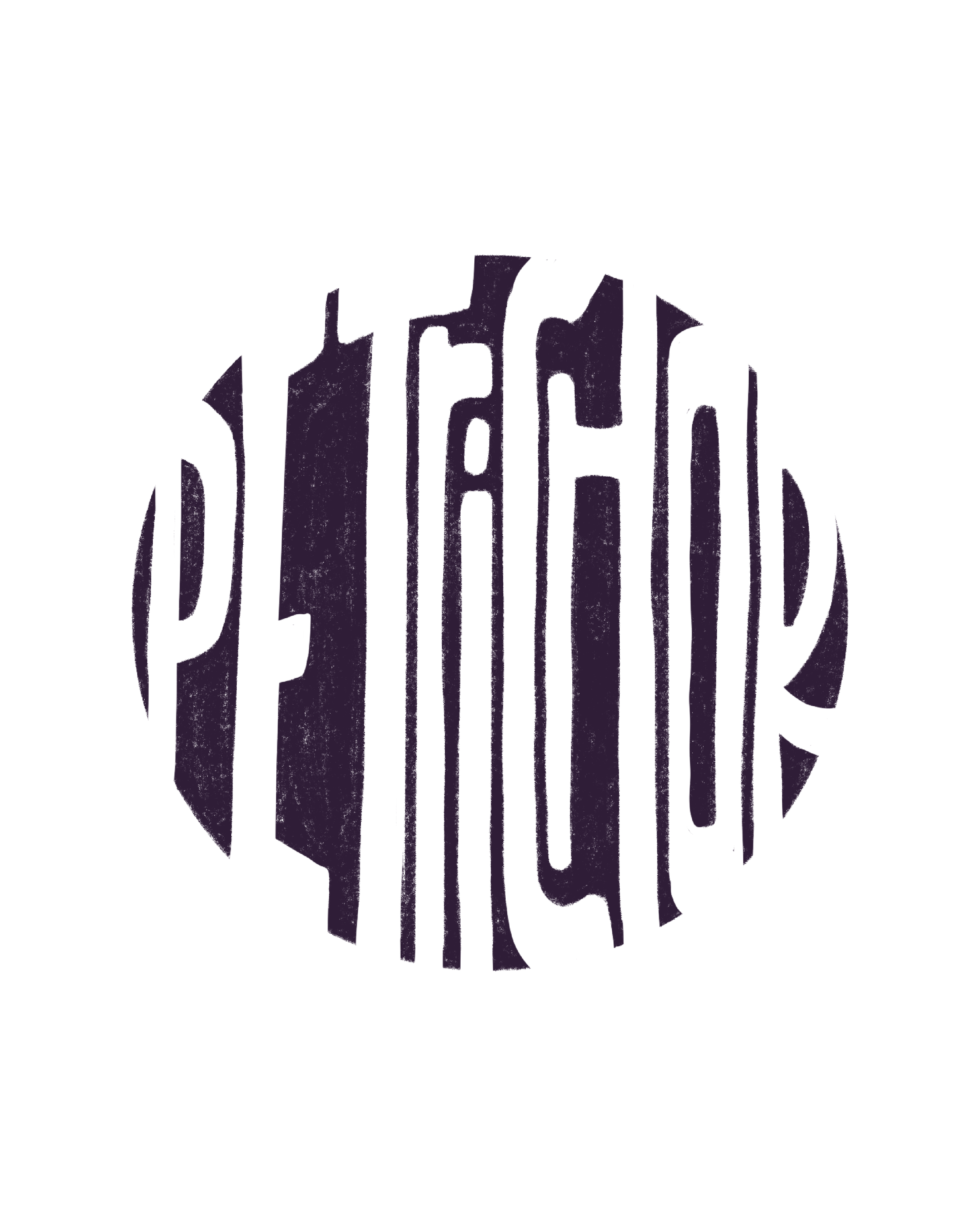
The first layout I did was filling the entire circle with the word. It sounds simple in theory, but when you actually try it, it’s more challenging than you’d think, especially with such a long word!
You’ll likely have to play with stacking and shrinking letters to make it all fit. I recommend starting by writing the word out to make sure it fits inside your circle, then go in with a block lettering style.
This layout really benefits from smart use of negative space, which can give you more room to work with visually. It's easy in concept, but a true test in execution. It’s so easy to make it illegible!
Add Design Elements to Fill the Circle


The next three styles all approach the circle similarly. Instead of trying to fit the entire word inside the full shape, I added design elements around the lettering. Makes it much easier to read.
For all of these, I started with a monoline base sketch. The overall structure of the word stayed the same (shoutout to that consistent “P”!). Then, I customized each one with different stylizations: one with serifs, one with bubble letters, and one with a vintage-y flair.
In the first version, I couldn’t quite fit the whole word inside the circle. So, I embraced the overflow and let some elements extend beyond the lines. I still tried to give the composition a circular feel so it looked intentional and cohesive.
The second version kept things a bit simpler with horizontal lines. It’s a little more structured, but you can always add decorative details or integrate parts of the letters (like extending the top bar of the “T”) into those horizontal lines to help unify the design. Might also make it a bit more interesting.
And finally, the third version was all about flourishes. Flourishing isn’t my strong suit, but the circle shape really helped keep things from getting messy. Pro tip: try to keep your flourishes in oval shapes rather than perfect circles; they tend to look more graceful and intentional that way.


The Takeaway
This week’s (and every week’s) exercise is all about sketchy practice, so let go of perfection! Try filling a circle, working outside of it, adding details, or experimenting with styles you’re not familiar with.
Use the circle as a guide, not a rule. And remember, you can think outside the circle.
Whether you’re just learning, experimenting, or pushing your lettering further, the key is to enjoy the process. If a sketch doesn’t turn out the way you hoped, take a look and ask: “What can I improve in my next circle?” That’s how growth happens.
So get sketching, get playful, and, most importantly, embrace the penjoyment. Because without that joy, you won’t want to keep going. And this journey is worth continuing.
Let me know if you try this prompt! Tag me or use #LetterWithMe on IG/FB so I can cheer you on!
Happy lettering!