How many lettering styles should I use?

This is actually a question I get often, and I totally get it.
A lot of what I create is self taught through trial and error. My inner monologue is often hey, this looks decent; oh goodness, this is terrible; hey, I like this; what the heck was I thinking?! etc. etc. I had never really taken a lettering course until I was pretty established in what I was doing. So when I started taking courses (because we always want to be learning) and seeing teachers recommend only including two or three lettering styles max per composition, I was like ...
*Record scratch* Wait, what?!
Have I been doing it wrong all this time?
Because as you can see from many of my pieces,


I don’t generally stick to two or three lettering styles per piece.
As a matter of fact, I dislike only having two styles per piece because it's so boring (to create). The fun of creating and looking at lettering compositions (to me) is the combination of various styles and how they work alongside each other.
So why does my hodgepodge of styles work when everyone else is recommending fewer styles?
After much analysis and scratching of my head, I realized that even though it looks like my lettering pieces have a lot of different styles, they are generally based on two or three basic lettering styles.
I tend to stick to block/bubble letters, serif letters and faux calligraphy. Then I spice up these basic styles with various stylistic designs.
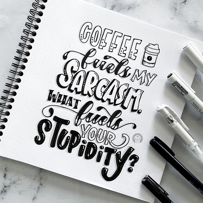
Let's take a look at my IG post from this week. I have "coffee," "my," "sarcasm," "your," and "stupidity" as the same style - block letters. Then, I tweaked each word to be a little different, for example by adding dots or lines to the inside of all the letters,
making "sarcasm" 3D, and rounding the corners of "stupidity". I also varied their sizes and colored in "stupidity" with black. But otherwise, they are all essentially block letters.
Then, I use the faux calligraphy style for "fuels." I tend to use the same basic lettering style for words that are the same within a quote and just change up the decorative styling of the words. And finally, "what" is a basic serif with lines inside.
So, as you can see, I do follow the guidelines of not having more than 3 lettering styles per piece. I just make them all a little different by using a variety of stylistic elements.
The next frequently asked question, then, is how do I choose what style to use. Great question! I shall address this in next week's post.