Letter with Me - Fard in 3D
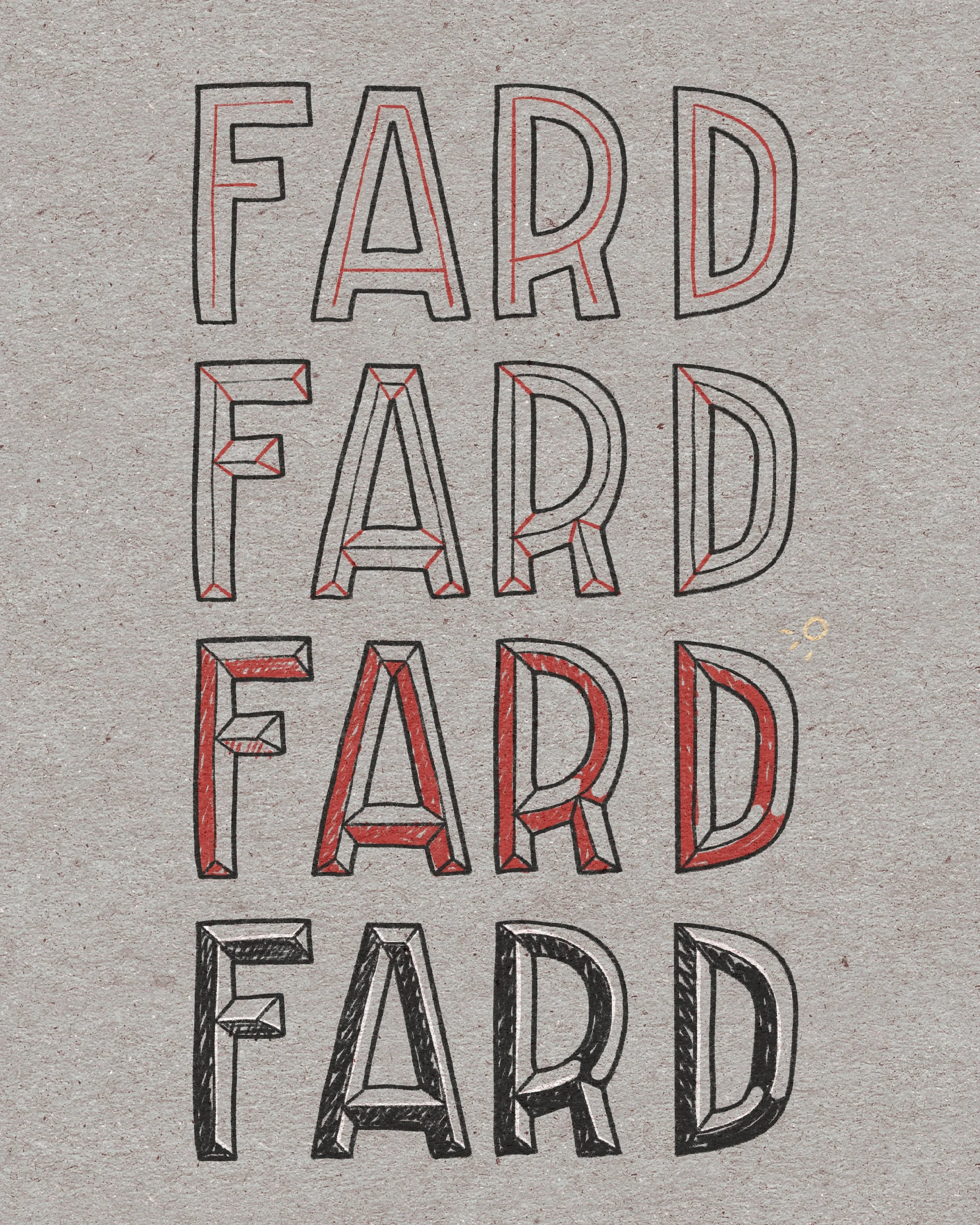
This week’s Letter with Me word is fard and since it’s such a short word, I thought it would be a great example to learn some 3D techniques! Adding dimension to your letters is one of the simplest ways to make them pop off the page. Today we’ll explore four different techniques: drop shadows, embossing, debossing, and bevels. Each one creates a totally different feel, and once you understand the basics, you can mix and match to your heart’s content.
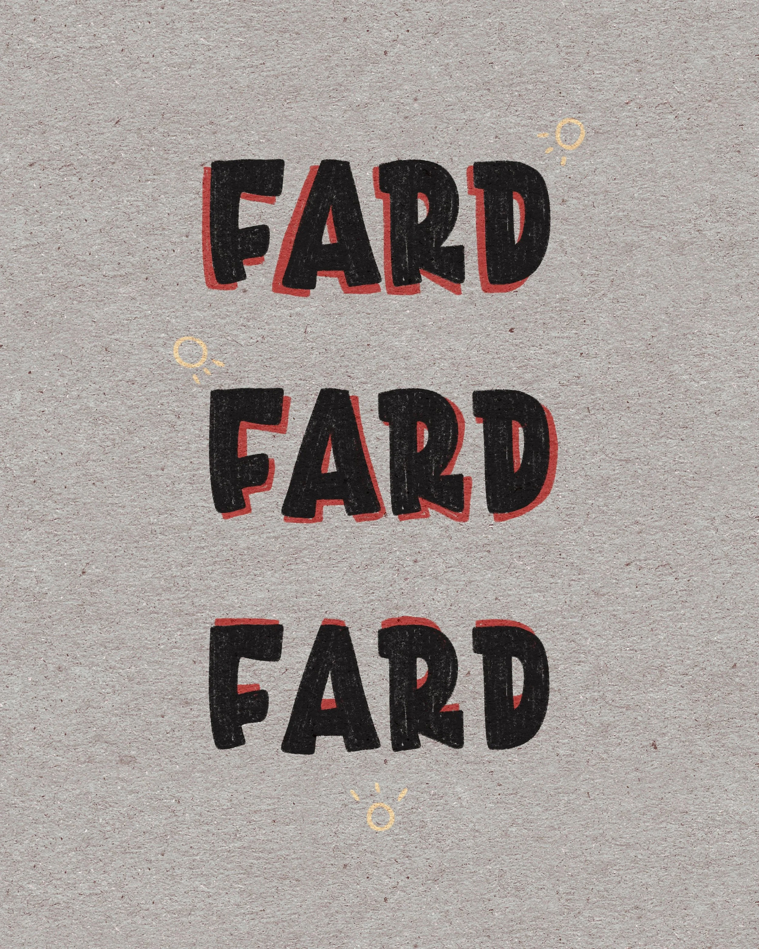
Drop Shadow
The easiest way to create depth!
Pick a light source (top-left, top-right, bottom, etc.). Depending on where your light source is, your shadow will be on the opposite side since your letters are blocking the light.
Using your light source as your guide, redraw the edges of your letters slightly offset.
Fill in the shadow space.
Result: Your letters instantly look like they’re floating above the page. Try experimenting with bold, dark shadows for drama, or lighter shadows for subtlety. It takes a bit to wrap your brain around how the shadows will fall, but remember, it doesn’t have to be perfect. Be consistent in the weight of your shadow and where they fall for each word, but we’re not aiming for realism here!
I tend to stick to one direction (light source in upper right), so find what you’re most comfortable with and there’s no shame in sticking to it. I had to really think about the other shadows in my example after years of doing it the same way. Even in my illustrations I tend to do the same. At some point, it’s just muscle memory!
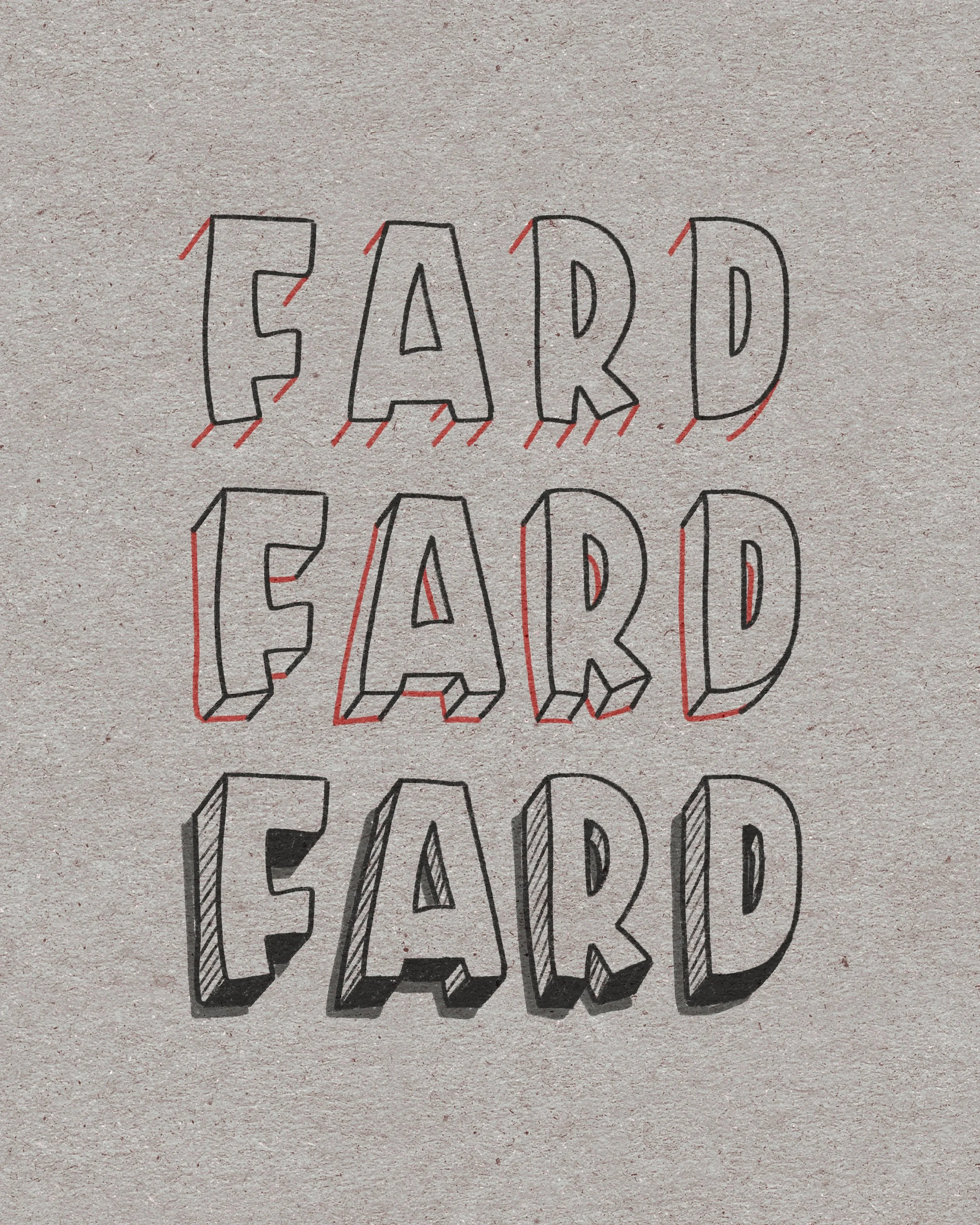
Embossing
This method is probably the most frequent way I do 3D letters. It follows the same idea as shadows, so I always start by thinking about my “light source.” Like I mentioned previously, I tend to do upper right, so my 3D letters follow the same as my shadow letters. The only thing different is I start with diagonal lines on all the corners. Then I connect them by following the lines/curves of my base letters. Make sure your diagonals are all consistent in angle, otherwise it won’t look very 3D.
After constructing your letters, you can color in the 3D section or do some diagonal lines. Add some shadows to make your word pop even more off the page. You can also make it look like there’s a dip in the middle of your letters if you mess around with the shadows! Once you step into the world of 3D, possibilities abound!
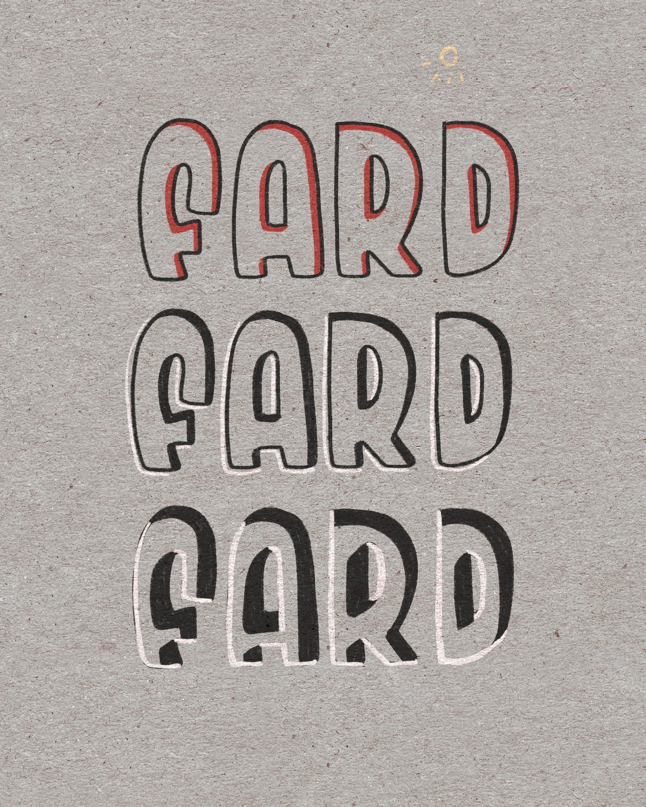
Debossing
Next we have the opposite of embossing - having the letters “sink” into the page. And this is again done doing shadows, so depending on where your light source is again, we’re going to do the opposite of 3D/shadows. As you can see in my example, the light source is once again in the upper right corner, so my shadows are also going to fall on the top right corners of my letter. The important thing about debossing is adding highlights to the opposite side. If you think about it, light that falls on an edge is bright, so that’s what gives your letters the sunken feel.
And you can make your shadows bigger or smaller, depending on how you feel. The bigger the shadows, the deeper your letter looks to be sunken in! You can also put your highlight right on top of your outline or to the side of it. Both give different feels, so there’s no right or wrong. Go with what you like!
Bevel Lettering
And last we have bevel lettering. A bevel makes your letters look like they’ve been cut with angled edges (think engraved plaques or old signage). If this is your first time trying this style, I would try to do block letters. It’s easier to see the corners and will make your life easier.
Draw your base letters.
Add a monoline in the middle of each letter leaving a gap at the ends of the letter.
Connect the corners of your letter to the inner line with diagonals like in my example. The ends of each letter will be a triangle, and inner corners will more often be a straight diagonal unless the monoline is connected to another monoline, e.g., the cross arms of F and A.
Once you’ve added in all the diagonals, color in the sections that are in shadow, once again depending on where your light source is.
You can leave as is or add white highlights to the tops of the sections that are in light. Remember, edges tend to light up when there’s a light source shining on it!
And now you have simple bevel lettering that’s sticking out. If you do the shadows opposite, then the bevel is sinking into the page.
Final Thoughts
And just like that, you have 4 new styles you can incorporate into your lettering pieces. 3D effects can feel intimidating, but once you break them down into these simple steps, they’re actually really approachable. Practice them with different words, styles, and colors, and remember, we’re practicing and learning and having fun. We are not aiming for perfection or absolute realism. Good enough is good enough!