Letter with Me - Gubbins
This week’s Letter with Me word is gubbins, a wonderfully quirky British slang term that means odds and ends, or miscellaneous. And what better way to celebrate a word that’s all about variety than by mixing and matching as many lettering styles as we can?
So this week’s challenge to go along with the word: give each letter in gubbins its own style.
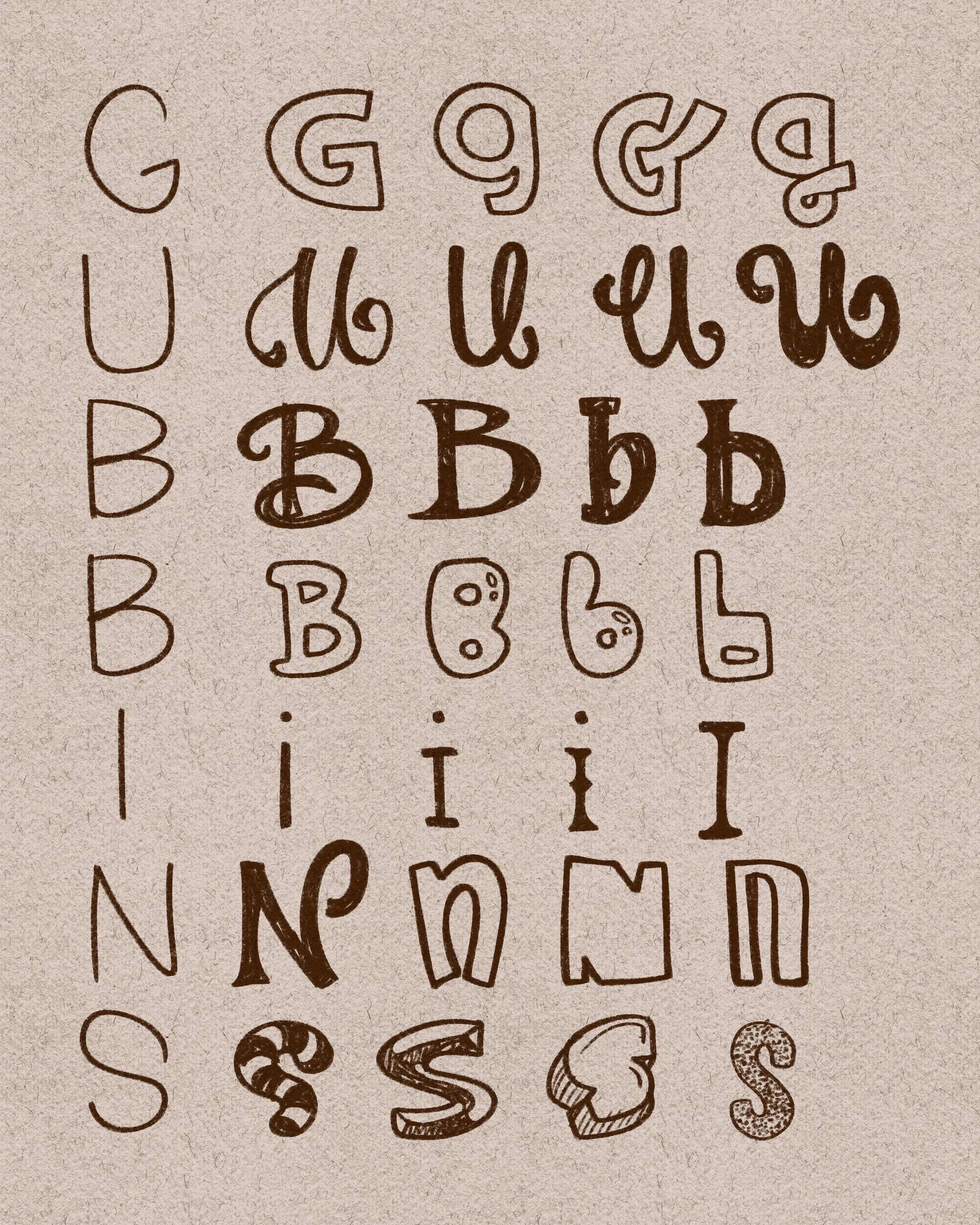
When doing exercises like this, I like to start off by writing the word out vertically, and then to the right of it, come up with as many styles as I can for each letter.
To make things more challenging (or easier if you prefer having constraints), you can make each letter a specific style. So for example, this is what I did:
G → Block letters. You can stick with all caps or do some lower case.
U → Loopy script-y style
B → Serif with different kinds of feet
B → Bubble letters
I → Monoline (thin, clean strokes)
N → Angular, sharp-edged style
S → Decorative (e.g., stripes, dots)
I tried to stick to my constraints as much as possible, but as you can see for N, the curve of the lower case N was hard to ignore. But, as usual, self-imposed rules can be broken in the name of learning and testing out styles. There is no right or wrong!
So, come up with some styles for each letter, I tried to aim for 4. You can do more, but I wouldn’t do less. Even if you initially can’t come up with a different style, doodle random lines or look at some images of signs/logos online to inspire you. I bet you there are styles knocking around your head, you just have to give it time to percolate and come through. The more you do per letter, the easier these styles will plop out of your brain!
Next step is to pick a style per letter you like and make it into the word!
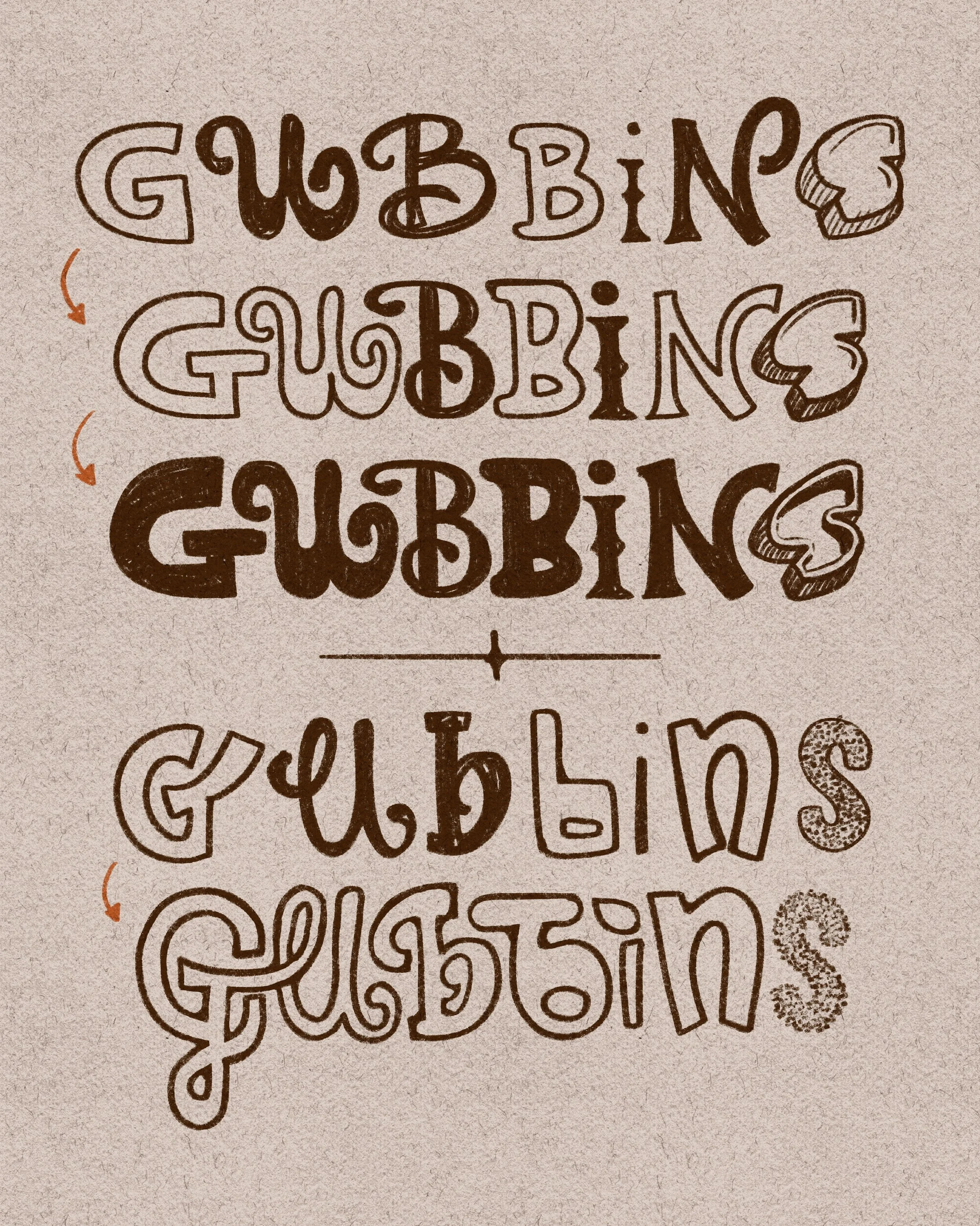
And make it cohesive!
After putting the letters together, we could end here. However, I personally feel like this gives it a kidnapping ransom note vibe with the letters individually cut out of a magazine look. If that’s your style, great, but I like to make things more cohesive.
A lot of it comes down to weird spacing issues and different-sized letters, so let’s modify each letter to make them fit better together.
I elongated the crossbar on the G so that it fit under the initial swirl of the U. I narrowed my first B to match the second B, but also elongated the top serif so it fit into that space above the ending swirl of the U. As you can see, it’s kind of like playing Tetris, fitting the pieces so they look like one word instead of separate letters smooshed together.
And for the last row, I tried to color it all in so it looks even more cohesive, but you could take it in the opposite direction and lean into the miscellaneousness of the word and use different colors for each letter. Whatever suits your style! and mood!
I did a second example and again tried to modify each letter so they fit well into the space of one another rather than letting each letter seem like they’re standing alone. Did I succeed? You tell me!
This exercise is such a great way to practice different lettering styles all in one word. You’ll not only end up with a funky piece full of personality, but you’ll also build up your lettering toolbox for future projects.
Short post today, but there’s so much you can do with this challenge. Don’t forget to tag me @nolalettering if you do this challenge on social media! I can’t wait to see what you come up with!