
Pencil First or Pen First?
Do you sketch first with pencil? or do you dive right in with pen?
Spoiler alert: there’s no one right answer.
But there are some real pros and cons to both. So today, I’m breaking them down—because depending on your project, your mood, or even how much coffee you’ve had, one approach might work better than the other.

It’s Not Talent. It’s Practice….
I get this comment a lot:
“You’re so talented at lettering!”
And while I always appreciate the kindness behind it, I also want to shout from the rooftops: It’s not talent. It’s practice.
A lot of practice.
Like, years of it. Like, “here’s some of my old work so we can cringe together” levels of practice.

Why does my lettering look weird?
While I wouldn’t say this is the #1 mistake new hand lettering artists make, it’s definitely in the top 3. If your lettering always looks off, it’s probably this.
And no, it’s not your pen/paper/iPad. Nor your your lack of “natural talent.” And it’s not even that one letter you keep redrawing over and over and that’s why it looks weird.
The real reason?
Inconsistent spacing and messy baselines.

Exploring Lettering Styles Using Simple Shapes
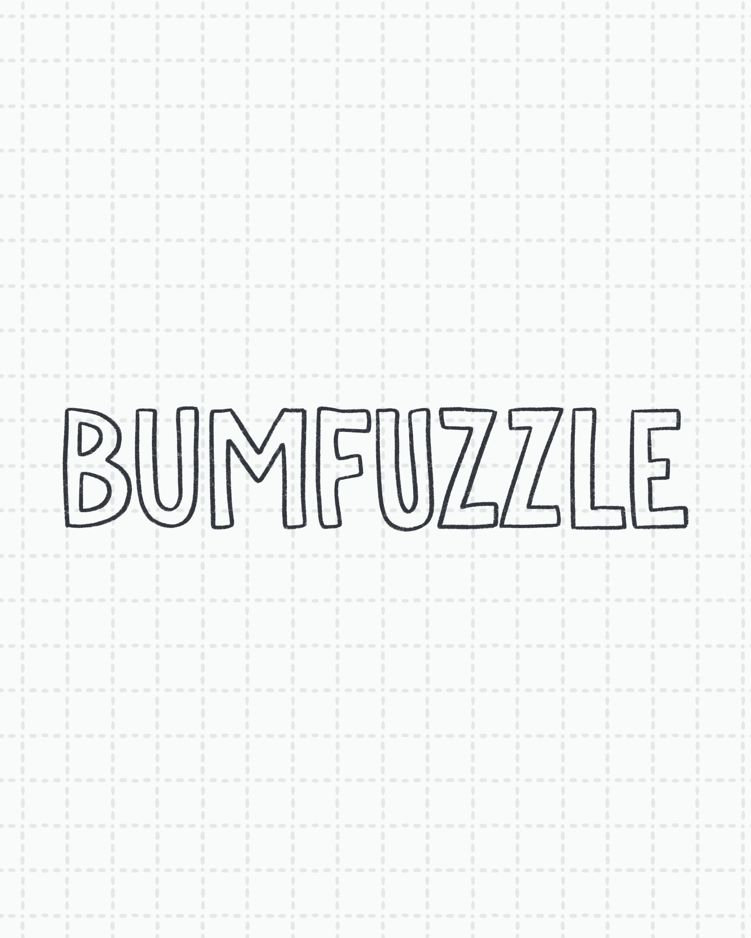
Today’s post is all about letting loose, getting weird, and embracing the beautifully imperfect process of developing your own lettering style. We are going to use basic shapes as the inspiration and boundaries for creating different styles of the same word: poppycock. Yep, poppycock. It's fun to say and to letter!
How to Develop Lettering Styles
One of the most frequently asked questions I used to get back when people actually asked me things (hi, I miss you) is: “How do you come up with all these different lettering styles?” And honestly? I don’t. Not in the way people seem to think.
