
Why does my lettering look weird?
While I wouldn’t say this is the #1 mistake new hand lettering artists make, it’s definitely in the top 3. If your lettering always looks off, it’s probably this.
And no, it’s not your pen/paper/iPad. Nor your your lack of “natural talent.” And it’s not even that one letter you keep redrawing over and over and that’s why it looks weird.
The real reason?
Inconsistent spacing and messy baselines.

Exploring Lettering Styles Using Simple Shapes
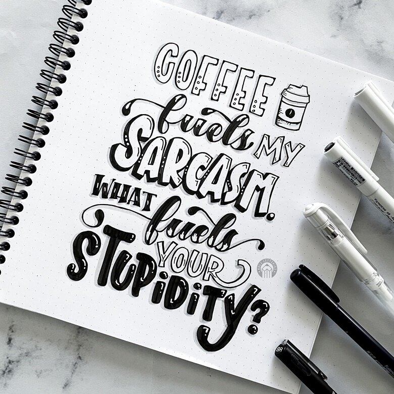
Today’s post is all about letting loose, getting weird, and embracing the beautifully imperfect process of developing your own lettering style. We are going to use basic shapes as the inspiration and boundaries for creating different styles of the same word: poppycock. Yep, poppycock. It's fun to say and to letter!
How to Develop Lettering Styles
One of the most frequently asked questions I used to get back when people actually asked me things (hi, I miss you) is: “How do you come up with all these different lettering styles?” And honestly? I don’t. Not in the way people seem to think.

How many lettering styles should I use?
The age old question, how many lettering styles should you include in a composition? Read on to find out!

How to Choose Lettering Styles
A frequently asked question is how do I choose what lettering styles to include in a composition. Read on to find out!